A brand new look
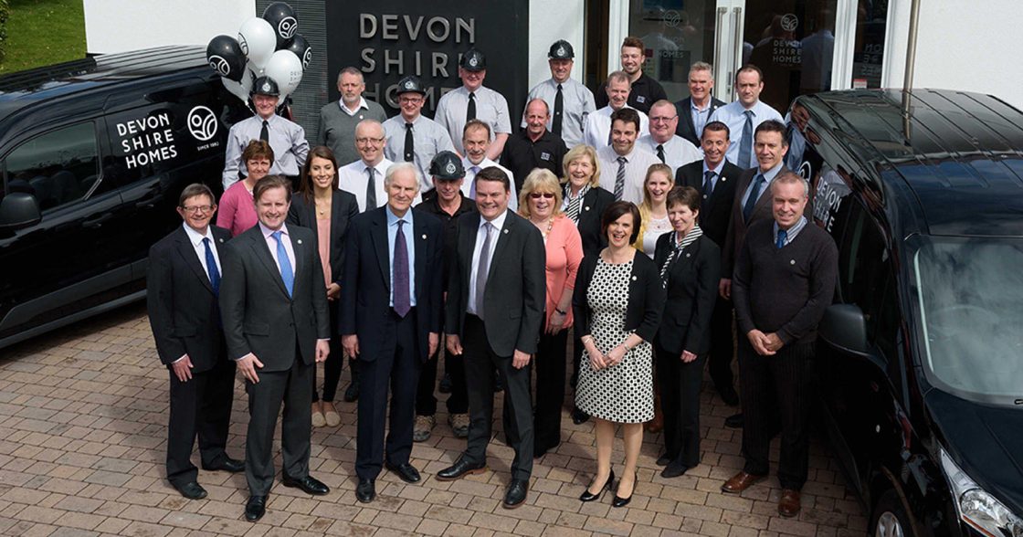
5 April 2016Tiverton house builder Devonshire Homes has unveiled its new look with the launch of fresh corporate branding.
Designed by Exeter-based brand design studio Believe in, the company’s logo has been transformed into a dramatic black and white design that incorporates a new ‘maker’s mark’ symbol.
“With Devonshire Homes fast approaching its first quarter century, it was time to update the story that the company was presenting to the world.”
said Devonshire Homes Managing Director Steve Russell.
“We are building more houses than ever in the county, becoming much more ambitious in our house designs and exploring new areas in regeneration and restoration.”
Founded in 1992, Devonshire Homes is the house building subsidiary of London and Devonshire Trust. Trust Chairman David Heathcoat Amory who was at the unveiling said: “In 1816 John Heathcoat moved to Tiverton from Derbyshire and built houses for his workforce which still exist in the town today. I think he would be delighted and proud that his descendants are still in the business of providing quality homes for the growing population of Devon.”
Devonshire Homes asked Believe in to create an identity that reflected the homes and neighbourhoods that the company builds - contemporary and in tune with modern needs, but built using traditional crafts and values.
“As an independent and local house builder we want to clearly set ourselves apart from the large national high volume builders,” Steve Russell added. “This is an exciting time for the company and we want our corporate image to reflect that. Our new identity is a contemporary interpretation of traditional values, much like our houses. It's bold, and reflects a confident position based on many years building beautiful homes for the people of Devon.”
Believe in Strategic Director Tim Burley said:
“The wordmark is strong and robust, and the accompanying icon feels like a traditional maker’s mark - a symbol of quality and authorship. Using black and white for the core identity has given us the freedom to explore a much broader palette of colours on the individual developments. As with all brand projects, we're trying to create something that will add real value and stand the test of time. To unify the people who work for a business behind a shared idea that they can all believe in and support.”